
Staten Island Hunger Task Force Behavioral Analytics
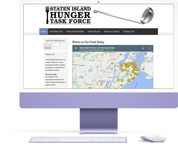
USER BEHAVIOR STUDY FOR DESKTOP WEBSITE
Understanding how users interact with zip code calendars, maps, and pantries resources on the SIHTF desktop website.
Project Overview
The aim of this user behavior analysis is to understand what features of the SIHTF desktop website is effectively being used to find information about pantries with the help of Google Analytics and HotJar heat maps/recordings. And gather insights on what resources and features aren't contributing to the organization’s mission forward.
A team of four user experience researchers analyzed the data gathered from Google Analytics and HotJar for a specific period of time. Based on that the researchers gathered three major insights and addressed these with recommendations for them.

The Staten Island Hunger Task Force (SIHTF) is a non-profit organization that aims to connect members of the community to pantries and vice versa. They also collaborate with organizations and people who want to donate food and goods to pantries in need.
Their mission is to:
-
Help people find food by providing information about pantries, locations, and hours of operation.
-
Support pantries with finding food, volunteers, and resources.
Research Objectives
01.
Use behavioral analytics to understand whether it is necessary for the SIHTF to keep updating the Zip Code Calendar and the Map features on the desktop website
02.
Identify where critical user pain points occur on the SIHTF desktop website.
User Profile
Who are these visitors and why do they use SIHTF website?
Most of the visitors who visit SIHTF website are residents of New York specifically Staten Island and the City.
After a discussion with our client we identified some user profiles who use and benefit from this website:
-
People who are in need of food.
-
Healthcare workers who want to help people find food.
-
Volunteers who are looking out for pantries to help.
Research Questions
01. How do users navigate through the desktop website to find information about pantries?
02. How frequently are the Map and Zip Code Calendar features used on the desktop website?
03. Which other feature(s) on the website are used to find information regarding the pantries?
04. Where are drop-offs occurring on the desktop website?
Methodology
Methods and Metrics used
We complied the data collected from Google Analytics and observed common trends among it. We focused mainly on the bounce rate, user behavior, device information and user flows on the homepage, pantry and resources pages. In addition to that, we used HotJar to study from the recordings, click percentage, user scrolling and moves.
Time Frame:
Google Analytics: 1st January - 5th October 2022
HotJar: 15th September- 5th October 2022
Key Observation
There is an increase in the number of NY desktop visitors in 2022 as compared to 2021.
The zip code calendar had more visitors between January - October 2022 as compared to January 1 - December 2021.
Between January 1, 2022, and October 5, 2022, 486 (4.86%) users NY Desktop users visited the zip code calendar.

Insights and Recommendations
Insight 1: Zip Code Calendar: Users kept switching from the zip code calendar to the home page
Findings:
-
It is likely that users keep going back and forth between the zip code calendar pages and the home page because at the moment.
-
There is no functionality on the zip code calendar pages to toggle between different zip codes.

Google Analytics data shows how users keep going between the zip code calendar and the home page.
Recommendation:
Allow users to change the zip code on the zip code calendar page itself so that users don’t have to keep navigating back and forth between the zip code calendar pages and the home page.

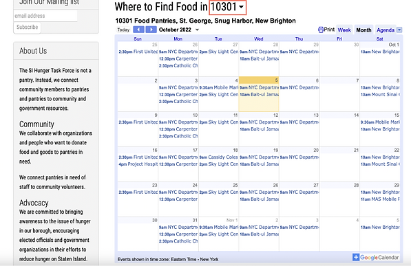
Recommended design: Add drop-down so users can change the zip code on the calendar page itself.
Hypothesis
Due to a lack of accessibility, users aren't using the map to find information about pantries' hours.
Findings
-
Most of the users use the pantry links on the home page to get more information about the pantries.
-
Analytics data indicates that users keep going back and forth between the zip code calendar pages and the home page.
-
It is possible users are trying to find information about pantries from the map, but are hindered by the fact that the pantries map does not make this information easily accessible.

Google Analytics user-flow data shows how users keep going between the zip code calendar and the home page.
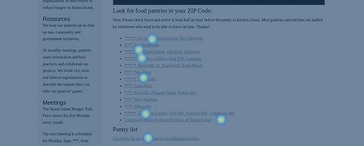
HotJar data indicate users directly use zip code links to visit the calendar page.
Limitation: Google Analytics and HotJar do not track movement and click on Google Maps.
Recommendation:
Conduct a Usability Test to understand how visitors are using the maps feature on the homepage.
How do users find information about pantry working hours on the SIHTF desktop website?
Rationale: Since the web analytics tools were unable to collect any data from the map feature on the SIHTF desktop website, it is still unclear i) whether users utilize the map ii) how users interact with the map. Hence, we recommend conducting follow-up usability testing to understand how users utilize the map.
Task Example: You live in a Staten Island neighborhood with the zip code 10301. Find the hours of operation of a pantry in your zip code.
A/B Testing Suggestion 1
We recommend conducting an A/B test to identify which heading for the map leads to the most clicks.
Goal:
To test if changing the map’s heading leads to an increase in the number of clicks on the map.
Hypothesis:
Users are not using the map at the moment because its purpose is unclear due to a vague heading.
Evaluation metrics:
Number of clicks on the map.
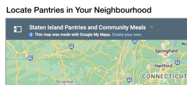

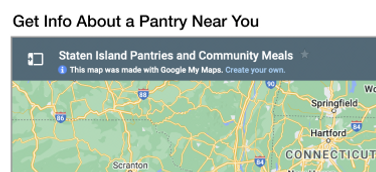
Heading options to test for A/B testing
Insight 2: Pantries List: The pantries page has a high drop-off and bounce rate, but it is one of the most visited pages.
Findings:
-
We observed that the pantries page has a high bounce rate (81.4%)
-
However, 828/2916 (~30%) users visited the pantries page in the selected time period.
-
The page also has high drop-offs - 36% of pantries visitors and 4.3% of homepage visitors.
-
Hotjar shows that the majority of the clicks and movements occur only in the first half of the page.
-
Since users are not scrolling till the bottom, they might miss information about soup kitchens and additional pantry details.
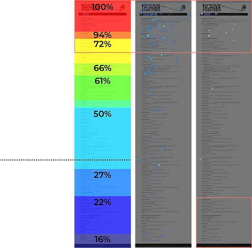
Users may find it difficult to look for the information of interest here.
50% of users did not scroll beyond this point
Average fold

Google Analytics data shows user bounce rate.
Recommendation:
Update the design such that scrolling is minimized and information is organized in short sections.
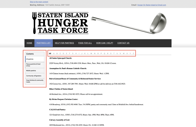
Recommended design: Make use of the navigation panel.
A/B Testing Suggestion 2
We recommend conducting an A/B test to identify which design variation of the pantries page users find more digestible and useful.
Goal:
To test if the page redesign increases the number of clicks in the left navigation panel to go through the contents of the page.
Hypothesis:
Users can process information faster if they see an overview of the type of content in the pantries page.
The left navigation panel is a more organized way of displaying the page’s content.
Evaluation metrics:
Number of clicks for each section in the left navigation panel of the redesign
Insight 3: Help for Pantries: The page has high page views but only half of the users scroll to the bottom.
Findings:
-
High page views and low bounce rate for the ‘Help for Pantries’ page.
-
50% of users scroll to the bottom of the page.
-
9.09% of users clicked on the side navigation bar.
1 user out of 5 sessions used the side navigation bar
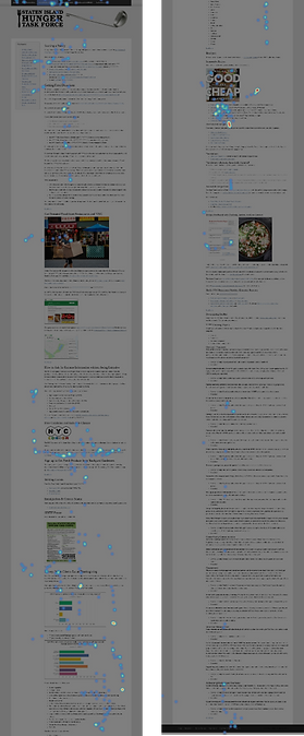
Heatmap- of clicks and mouse hovers indicate interest in the recipes & free condoms section
Mouse movement shows users interested in reading other sections even though they have to scroll.
Recommendation:
Update Make the left side navigation bar more prominent and keep the content concise to make the page more accessible and appealing. In our recommended design, when a user clicks on a particular section in the side navigation bar, only that section's content will be shown on the page.

Recommended design: Make use of the navigation panel.
Client Feedback
This is wonderful!
Let's do the A/B testing for these recommendations.
We presented our insights and recommendations to our client via a zoom meeting. The client Susan Fowler was really happy with out work and showed keen interest in setting up the A/B testing for our recommendations. She asked us to study user flow for the month of September 2022 as she changed a few things in the website.
Next Steps
The next step would be setting up the A/B Test Study for the client on Google Optimize so they can analyze the effectiveness of our recommendations.
I learned an important lesson that one shouldn't always fully reply on one method for testing. It important to understand the short comings of a certain method and combine it with other methods to achieve effective results.
