Storyteller
A Design System for Goodreads
Overview
Building a design system for the Goodreads website to improve its user experience and help internal stakeholders with its maintenance and expansion of it.
Goodreads is one of the most popular online communities for book lovers, with millions of users worldwide. Despite its popularity, the platform's design is inconsistent, lacks a visual language and is difficult to navigate for a wider user base, leading to frustration among users. To address these issues, a team of designers embarked on a project to create a new design system for Goodreads. The goals of the project were to enhance the user experience, create a consistent inclusive design system that is helpful for the program managers to flow, designers to use, developers to build from, and accessible to all types of users.

My Role: UI/UX Design, Documentation, Accessibility Design
Team Members: 2 UX Designers and 1 UX Researcher
Duration: 6 weeks
Goodreads is a social media platform designed for book lovers. It allows users to create virtual bookshelves, track books they have read, want to read, and are currently reading, and leave reviews and ratings for books. The platform also provides personalized book recommendations based on a user's reading history and preferences. Goodreads features an active community of book enthusiasts who can connect with each other through discussion forums, groups, and events. It is a popular resource for discovering new books, connecting with other readers, and sharing insights and opinions on books.

Storyteller Design System
Design with purpose, read with joy!
INCLUSIVE
Flexible, perceivable, operable, and robust Ssystem
INFORMATIVE
Guidelines and resources demonstrating its practical application
ACCESSIBLE
Ensuring accessibility for all users of the platform regardless of their abilities
Goals
What are the main principles of the Storyteller Design System aims to achieve?
Understanding Goodreads current system
Oops!!
Goodreads doesn't have a system
Goodreads' website lacks consistent components, with no defined visual language.
One of the significant issues with the site's design is the lack of consistent components. Components refer to the various visual and interactive elements that make up a website, such as buttons, forms, typography, and colors. Without consistent components, users encounter different styles and layouts across various pages on the site, making it challenging to develop a sense of familiarity or trust with the site. This leads to confusion and frustration among users, ultimately resulting in a negative user experience.
Conducting an audit
Once the audit was conducted we noticed inconsistencies in the types of buttons, font styles, and heights. On the same page, different headings were used with different font styles. The pages lacked a structure and seems to not have a grid. This would eventually lead to confusion amongst designer and add extra time for developer to develop as the elements aren't consistent.
Building a system
What are the core principles of Storyteller?
The design principles prioritize a user-centric approach, emphasizing consistency and organization to facilitate effortless goal achievement.
Consistent
Creating streamlined workflows that enhance usability and reduce cognitive load will enable users to achieve their goals with ease.
Recognizable
Design elements should be easily identifiable, with a clear and intuitive hierarchy that helps users find what they are looking for.
Efficient
By structuring information in a clear and accessible way, we can make it easier for users to complete their tasks quickly and effectively.
Effective
Utilizing simple, easy-to-use interfaces will provide users with maximum value for minimal effort.
Process
How to create a design system that retains Goodreads' identity while streamlining its interface?
Following the methodology of Atomic Design by Brad Frost
Atomic design is a methodology composed of five distinct stages working together to create interface design systems in a more deliberate and hierarchical manner. The five stages of atomic design are:
-
Atoms
-
Molecules
-
Organisms
-
Templates
-
Pages
Following this design approach- a new design system is created for Goodreads website.

01. Atoms

02. Molecules

03. Organisms

04. Templates

05. Pages
Atoms
Foundational building blocks of
our design system
Color
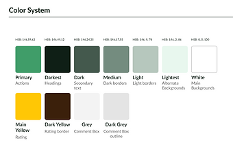
Separating and dividing it on the basis of its usage property. Here, the primary color is green (HSB: 146,59,62), so it is included as a primary color. While choosing the color palette, it was made sure that they have high contrast ratio so its eligible for all.
Typeface
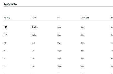
The font type used throughout the website is Lato and used it consistently throughout the website with clear headings and hierarchies for maximum readability.
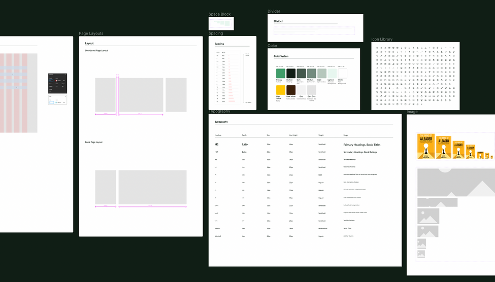
Fig1: A snippet from the Storyteller Figma library where all the color styles, font styles, and typography scales are mentioned as well as gird layout dimensions, icons, and spacing guides.
Molecules
Simple groups of UI elements functioning together as a unit
Atoms are the building blocks of a design system. Molecules are then built from these atoms, combining them into functional units that serve a specific purpose. By building molecules from atoms, a design system can ensure consistency across the website's user interface and make it easier to create new features or components.

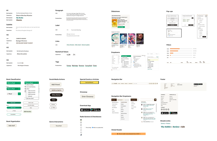
Fig2: Each component built follows the principles and guidelines set for the design system.
Organisms
Complex UI components, groups of atoms and molecules
Building molecules from atoms and organisms from molecules, a design system can create a library of reusable components that can be easily combined to create new features or pages on the website. This saves time and resources for designers and developers, while also ensuring that the website's design remains consistent and user-friendly.
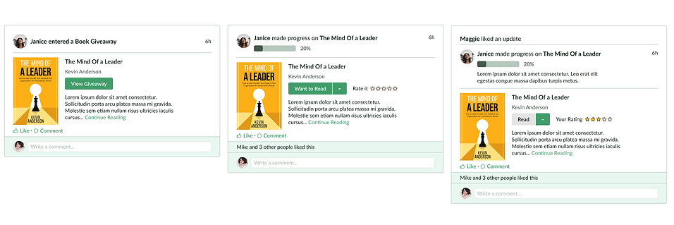
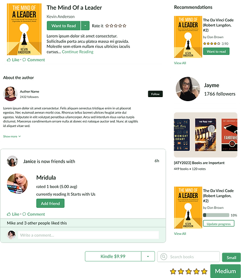
Fig3: The "book Modal" is a card type that has been used consistently throughout the site. The base organism is built from atoms and molecules then variations of components are added to it. So it can be used at multiple places depending on the requirement.
Different variations of cards are created using the same atoms and molecules, this ensures consistency in the website's visual language. This also allows designers and developers to easily reuse and combine these components to create new features or pages on the website.

Fig 4: The component library contains a vast range of components with variants based on the requirements. All these a built following the same principles.
Templates
Pre-designed layout that help in building a page
Templates serve as a starting point for designers to create new pages or components. It saves designers time and effort by providing a foundation for the design, while also ensuring consistency and adherence to the design system's guidelines. It also helps in maintaining brand consistency and improve the user experience by providing a cohesive look and feel throughout Goodreads website.
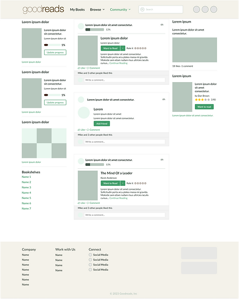

Fig 5 & 6: Examples of templates that designers can use to build pages for Goodreads. These templates even provide examples of how to use the spacing and grid to design consistently and efficiently.
Accessibility
It is important for all- users and well as internal stakeholders
An accessible design system is essential for its usefulness. Although this perspective often prioritizes the user, but it was important for both internal and external stakeholders.
Therefore, the storyteller design system provides clear explanations, documentation, and educational resources to internal teams regarding the UX team's work in creating an accessible design system. This ensures that everyone who is on board with this journey and can utilize this system to its fullest potential.
Documentation
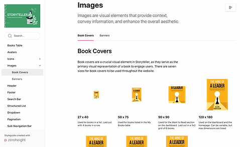
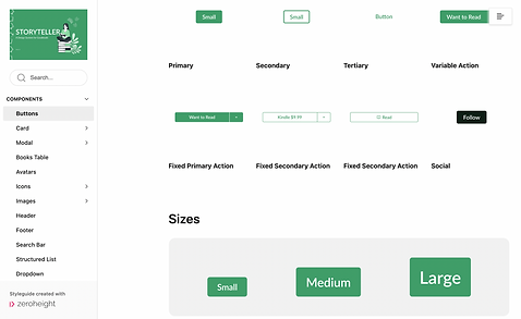
Zeroheight is a documentation tool that can be used to document and share a design system. By using Zeroheight, designers and developers can create a centralized location for all design system documentation, including style guides, design principles, component libraries, and more. This ensures that everyone involved in the project has access to the latest version of the design system and can easily reference it when creating new designs or features.
Next Steps
Future improvement of Storyteller
Developer Friendly
Collaborating with developers to add code to the design system and make it friendly for all stakeholders. Adding code to a design system is an important step in ensuring that the design system is scalable and maintainable, as it allows developers to easily build new features and components that are consistent with the design system's guidelines.
Governing
To use a design system efficiently it's vital to have a comprehensive list of Do's and Don't's. This helps the designer to understand how to use each component and what they shouldn't be doing as well.
Takeaways
Building a design system for an existing website requires collaboration between designers, developers, and project managers. Consistency is critical to ensure a better user experience and make it easier to build and maintain the website. Documenting the design system is important to establish governance rules, best practices, and to ensure all stakeholders have access to the latest version. Accessibility is essential for creating an inclusive user experience. Building a design system is an iterative process that requires continuous improvement and gathering feedback from users and stakeholders.